2 State of the art
2.1 Energy planning in cities
The decision-making tools mentioned earlier are part of an integrated energy planning logic. While the planning has been mostly done on a national scale, using integrated approaches for the development of cities and regions has been recognised as essential by previous research (Lenssen, 1996; Bhatt, Friley and Lee, 2010). The development of those approaches is pushed by the growing interest in using small cogeneration systems and distributed generation technologies based on renewable resources and the need for cross-sectoral analysis among different sectors (industry, households, transportation) (Mirakyan and De Guio, 2013). Mirakyan et al. analyse the existing methods and tools for energy planning in cities and territories. They found that a similar framework has been used for different cities (> 50’000 inhabitants) that divides the planning into four phases:
- Phase I: Preparation and orientations,
- Phase II: Model design and detailed analysis,
- Phase III: Prioritisation and decision,
- Phase IV: Implementation and monitoring.
In the context of this project, the focus is on phase II: how to provide a model and relevant analysis of the energy systems of a city in order to enable decision-making? The article reviews the methods and tools that have been implemented already for academic or commercial purposes. The models used could be classified according to two principal criteria:
- the mathematical approach: either a simulation model or an optimisation model. Simulation models describe the energy system or the economy using a set of rules. Therefore, it has a deterministic input-output (Lund and Münster, 2006). Optimisation models use a chosen target to minimise (e.g. GHG emissions, operating costs), given a set of constraints describing the system, to obtain a “preferred mix of technologies” (Vuuren et al., 2009).
- the analytical approach: top-down vs bottom-up. The terms top-down and bottom-up can be translated into aggregated vs disaggregated models. They are the two paradigms to model the links between the economy and the energy system (IPCC, 1996). The typical top-down model focuses on the broader economy and incorporates policy-induced changes and their effects on different markets. They often do so on the basis of historically calibrated factors. The focus is on the market rather than on technological details of energy production or conversion. Sectors are mostly represented by smooth functions. One of the shortcomings of the conventional top-down approach is the inability to incorporate the evolution of energy technologies. It also does not always respect physical principles such as energy and mass conservation. On the other hand, the bottom-up approach starts with a physical and economical description of the technologies in detail. It looks at how individual energy technologies can be used and substituted to provide energy services. It focuses on the energy system rather than the market. Some of the bottlenecks are the difficulties in accounting for market interactions and the complexity of the model due to a high number of parameters. The two categories are not strict, and approaches that attempt to combine the two were implemented (Böhringer and Rutherford, 2006; Vuuren et al., 2009).
Because the top-down approach relies on smooth functions that need to aggregate data, the more the scale considered decreases, the less the approach makes sense. Additionally, from an energy engineering perspective, it is tempting to consider the details of the conversion, generation and storage technologies and so a model oriented towards a bottom-up approach.
The choice between simulation and optimisation models depends on the aim of the planning. Indeed, simulation modelling helps in picking between scenarios (for instance, by twisting the carbon tax, simulates the price evolution of space heating in the residential sector). It requires strong modelling. It does not take an optimal decision but rather tells which decision is the best among a set of possible ones. On the contrary, optimisation modelling finds an optimal decision for the given situation. It requires solid assumptions and a good description of many factors. According to Mirakyan and De Guio (2013), simulation models are more often employed on a city scale. They are easier to set up at this scale because optimisation models require either a large number of parameters, or important assumptions.
However, in both cases, the evaluation of urban planning energy scenarios is computationally very extensive and suffers from the scarcity of the availability of buildings energy-wise data, essential as the input. Models can be really precise at a small scale (one building, for instance) but must give up some precision if a larger scale is desired. A solution is to decrease the number of buildings to be simulated or optimised. De Jaeger et al. (2020), Torabi Moghadam et al. (2019) developed the use of Machine Learning techniques to cluster the buildings of a city. The building stock is thus simplified using archetypes (i.e. average reconstructed buildings or sample buildings). To ensure the representativeness of the archetype, clustering methods can be instrumental.
Nevertheless, using building archetypes one cannot model the interactions of buildings between each other within a district. Indeed, while most energy designs addressed energy systems on an individual facility basis, leaving aside community-wide interactions, the development of the energy hub concept opened the door to a new level of complexity in energy modelling. An energy hub is a place where the production, consumption, storage, and conversion of multiple energy carriers occur. A single residential building is a micro-hub, whereas a collection of micro hubs together constitutes a macro hub, more commonly called a district (Middelhauve, 2022). However, the definition of a district in terms of energy hub and what should be the scale to consider yet has to be precisely defined, even though the concept of the district can appear intuitive.
This leaves the possibility to optimise a district energy system in two ways:
- Buildings scale: a set of buildings is given, each of them being considered as a system and solved independently,
- District scale: the whole set of buildings is solved together, enabling interactions between the buildings. It is sometimes also called district optimisation because the set of buildings forms a district.
Middelhauve (2022) shows the difference between the two approaches: with an identical total cost (TOTEX), the district scale leads to better results in terms of global warming potential (GWP), self-sufficiency (SS) and PV panels penetration (PVP) (Figure 2.1).
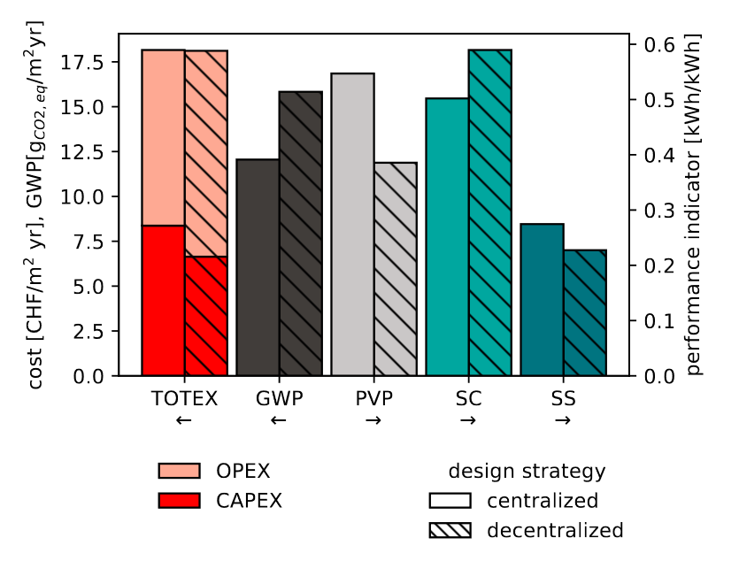
Figure 2.1: Comparison of optimal solutions with identical TOTEX for a residential district with 31 buildings. Comparison according to key performance indicators: GWP, PVP, SC and SS. Source: (Middelhauve, 2022)
A framework enabling to work with this centralised district-scale approach at the city level should thus be found. It should enable to consider the community interactions even when optimising the energy model for a city.
2.2 Machine Learning
The method proposed for the district typification uses Machine Learning concepts. It is a domain of artificial intelligence based on mathematics and statistics. The idea is to let the computer discover patterns among the data, allowing it to build a model from the data. Doing so repetitively, the computer “learns” and improves its performance for a specific task. The mathematical formalisation by (Mitchell, 1997) is:
“A computer program is said to learn from experience E for some class of tasks T and performance measure P, if its performance at tasks in T, as measured by P, improves with experience E.”
The tasks performed by ML can be divided into two prominent families:
- Supervised ML, where the computer is being told what are the characteristics to look at to find a pattern. For instance, image classification is a supervised learning task as the categories in which the image should be classified are known (one classic example: is it a cat or a dog?).
- Unsupervised ML. It aims to discover underlying properties from unlabeled training samples. Clustering is an unsupervised task.
Clustering algorithms divide a data set into subsets called
clusters. Doing so, they expose the common character of some data and
help see concepts that link or differentiate the data. Many different
algorithms exist: some rely on distance measures, on density, and others
on a probabilistic model (Zhou, 2021).
Figure 2.2 presents some of the most used clustering algorithms. As can be seen, depending on the set of data, different methods can lead to very different results. Therefore, the choice of the algorithm depends strongly on the data set.
Since the initial data is not labeled, it is more difficult to ensure
that the groups found by the algorithm are correct and that a data is
attributed to the right cluster. To coherently assign data that are
similar together (high intra-cluster similarity) and data that
are dissimilar not within the same cluster (low inter-cluster
similarity), performance measures (or validity index) are defined.
They are two types of index: external index, which compares the
clusters to a reference model (e.g. Jaccard Coefficient (JC)), and
internal index, that only looks into the clustering in itself
(e.g. Davies-Bouldin Index (DBI)). This part is called the clustering validation. Because clustering often finds patterns invisible to the naked eye, it is difficult to assess the clusters found. Therefore, a central part of the validation is the notion of cluster stability, i.e. the ability to build the same solutions on two independent samples from the same data source.
A standard method used to assess the stability of a clustering is to calculate the
Rand index for several iterations. It measures the difference from one
clustering to another.
The Rand index is named after its creator (Rand, 1971). The idea is to propose criteria to assess the performance of a clustering
method, such as “its sensitivity to resampling and the stability of its
results in the light of new data”. Given \(N\) points \(X_1\), \(X_2\), …,
\(X_n\) and two clustering of them \(Y=(Y_1,...,Y_{K_1})\) and
\(Y'=(Y_1',...,Y_{K_2}')\), the following subsets are defined:
- \(a\), the number of pairs in \(X\) that are in the same cluster in \(Y\) and the same cluster in \(Y'\),
- \(b\), the number of pairs in \(X\) that are in a different cluster in \(Y\) and in a different cluster in \(Y'\),
- \(c\), the number of pairs in \(X\) that are in the same cluster in \(Y\) and in a different cluster in \(Y'\),
- \(d\), the number of pairs in \(X\) that are in a different cluster in \(Y\) and the same cluster in \(Y'\).
The Rand Index is defined through Equation (2.1). The result is between 0 and 1 and measures the degree of agreement of two clusterings.
\[\begin{equation} R = \frac{a+b}{a+b+c+d} \tag{2.1} \end{equation}\]By computing the index on several iterations of the same clustering method on the same data, the index allows for evaluation of how well the method can retrieve natural clusters. When using it on cluster set from different methods, it helps to choose which is the best: for instance, if the score is similar, but the computing power is very different. This index has been modified to take into account the possible agreement by chance: the Adjusted Rand Index (ARI). If the index is below a certain number that depends on the size of the clustering (\(s\) and \(r\)), the clustering is not considered valid.
\[\begin{equation} min \;ARI = \left[1-\frac{1}{2}\binom{r+s-1}{2} \left[\binom{r}{2}^{-1} + \binom{s}{2}^{-1} \right] \right]^{-1} \tag{2.2} \end{equation}\] \[\begin{equation} if \; r=s: \: min \; ARI = \frac{-r}{3r-2} \end{equation}\]
import time
import warnings

import numpy as np
import matplotlib.pyplot as plt

from sklearn import cluster, datasets, mixture
from sklearn.neighbors import kneighbors_graph
from sklearn.preprocessing import StandardScaler
from itertools import cycle, islice
np.random.seed(0)
# ============
# Generate datasets. We choose the size big enough to see the scalability
# of the algorithms, but not too big to avoid too long running times
# ============
EPFL_darkgrey = '#413D3A'
EPFL_light_grey = '#CAC7C7'
EPFL_red = '#FF0000'
EPFL_salmon = '#FEA993'
EPFL_leman = '#00A79F'
EPFL_canard = '#007480'
EPFL_colors = {0: 'black', 1: EPFL_darkgrey, 2: EPFL_light_grey, 3: EPFL_red, 4: EPFL_salmon, 5: EPFL_leman,
               6: EPFL_canard}

n_samples = 500
noisy_circles = datasets.make_circles(n_samples=n_samples, factor=0.5, noise=0.05)
noisy_moons = datasets.make_moons(n_samples=n_samples, noise=0.05)
blobs = datasets.make_blobs(n_samples=n_samples, random_state=8)
no_structure = np.random.rand(n_samples, 2), None

# Anisotropicly distributed data
random_state = 170
X, y = datasets.make_blobs(n_samples=n_samples, random_state=random_state)
transformation = [[0.6, -0.6], [-0.4, 0.8]]
X_aniso = np.dot(X, transformation)
aniso = (X_aniso, y)

# blobs with varied variances
varied = datasets.make_blobs(
    n_samples=n_samples, cluster_std=[1.0, 2.5, 0.5], random_state=random_state
)

# ============
# Set up cluster parameters
# ============
plt.figure(figsize=(9 * 2 + 3, 13))
plt.subplots_adjust(
    left=0.02, right=0.98, bottom=0.001, top=0.95, wspace=0.05, hspace=0.01
)

plot_num = 1

default_base = {
    "quantile": 0.3,
    "eps": 0.3,
    "damping": 0.9,
    "preference": -200,
    "n_neighbors": 3,
    "n_clusters": 3,
    "min_samples": 7,
    "xi": 0.05,
    "min_cluster_size": 0.1,
}

datasets = [
    (
        noisy_circles,
        {
            "damping": 0.77,
            "preference": -240,
            "quantile": 0.2,
            "n_clusters": 2,
            "min_samples": 7,
            "xi": 0.08,
        },
    ),
    (
        noisy_moons,
        {
            "damping": 0.75,
            "preference": -220,
            "n_clusters": 2,
            "min_samples": 7,
            "xi": 0.1,
        },
    ),
    (
        varied,
        {
            "eps": 0.18,
            "n_neighbors": 2,
            "min_samples": 7,
            "xi": 0.01,
            "min_cluster_size": 0.2,
        },
    ),
    (
        aniso,
        {
            "eps": 0.15,
            "n_neighbors": 2,
            "min_samples": 7,
            "xi": 0.1,
            "min_cluster_size": 0.2,
        },
    ),
    (blobs, {"min_samples": 7, "xi": 0.1, "min_cluster_size": 0.2}),
    (no_structure, {}),
]

for i_dataset, (dataset, algo_params) in enumerate(datasets):
    # update parameters with dataset-specific values
    params = default_base.copy()
    params.update(algo_params)

    X, y = dataset

    # normalize dataset for easier parameter selection
    X = StandardScaler().fit_transform(X)

    # estimate bandwidth for mean shift
    bandwidth = cluster.estimate_bandwidth(X, quantile=params["quantile"])

    # connectivity matrix for structured Ward
    connectivity = kneighbors_graph(
        X, n_neighbors=params["n_neighbors"], include_self=False
    )
    # make connectivity symmetric
    connectivity = 0.5 * (connectivity + connectivity.T)

    # ============
    # Create cluster objects
    # ============
    ms = cluster.MeanShift(bandwidth=bandwidth, bin_seeding=True)
    two_means = cluster.MiniBatchKMeans(n_clusters=params["n_clusters"])
    ward = cluster.AgglomerativeClustering(
        n_clusters=params["n_clusters"], linkage="ward", connectivity=connectivity
    )
    spectral = cluster.SpectralClustering(
        n_clusters=params["n_clusters"],
        eigen_solver="arpack",
        affinity="nearest_neighbors",
    )
    dbscan = cluster.DBSCAN(eps=params["eps"])
    optics = cluster.OPTICS(
        min_samples=params["min_samples"],
        xi=params["xi"],
        min_cluster_size=params["min_cluster_size"],
    )
    affinity_propagation = cluster.AffinityPropagation(
        damping=params["damping"], preference=params["preference"], random_state=0
    )
    average_linkage = cluster.AgglomerativeClustering(
        linkage="average",
        affinity="cityblock",
        n_clusters=params["n_clusters"],
        connectivity=connectivity,
    )
    birch = cluster.Birch(n_clusters=params["n_clusters"])
    gmm = mixture.GaussianMixture(
        n_components=params["n_clusters"], covariance_type="full"
    )

    clustering_algorithms = (
        ("MiniBatch\nKMeans", two_means),
        ("Affinity\nPropagation", affinity_propagation),
        ("MeanShift", ms),
        ("Spectral\nClustering", spectral),
        ("Ward", ward),
        ("Agglomerative\nClustering", average_linkage),
        ("DBSCAN", dbscan),
        ("OPTICS", optics),
        ("BIRCH", birch),
        ("Gaussian\nMixture", gmm),
    )

    for name, algorithm in clustering_algorithms:
        t0 = time.time()

        # catch warnings related to kneighbors_graph
        with warnings.catch_warnings():
            warnings.filterwarnings(
                "ignore",
                message="the number of connected components of the "
                + "connectivity matrix is [0-9]{1,2}"
                + " > 1. Completing it to avoid stopping the tree early.",
                category=UserWarning,
            )
            warnings.filterwarnings(
                "ignore",
                message="Graph is not fully connected, spectral embedding"
                + " may not work as expected.",
                category=UserWarning,
            )
            algorithm.fit(X)

        t1 = time.time()
        if hasattr(algorithm, "labels_"):
            y_pred = algorithm.labels_.astype(int)
        else:
            y_pred = algorithm.predict(X)

        plt.subplot(len(datasets), len(clustering_algorithms), plot_num)
        if i_dataset == 0:
            plt.title(name, size=18)

        colors = np.array(
            list(
                islice(
                    cycle(
                        [
                            EPFL_colors[4],
                            EPFL_colors[5],
                            EPFL_colors[2],
                            EPFL_colors[0],
                            EPFL_colors[1],
                            EPFL_colors[3],
                            EPFL_colors[6],
                            "#e41a1c",
                            "#dede00",
                        ]
                    ),
                    int(max(y_pred) + 1),
                )
            )
        )
        # add black color for outliers (if any)
        colors = np.append(colors, ["#000000"])
        plt.scatter(X[:, 0], X[:, 1], s=10, color=colors[y_pred])

        plt.xlim(-2.5, 2.5)
        plt.ylim(-2.5, 2.5)
        plt.xticks(())
        plt.yticks(())
        plt.text(
            0.99,
            0.01,
            ("%.2fs" % (t1 - t0)).lstrip("0"),
            transform=plt.gca().transAxes,
            size=15,
            horizontalalignment="right",
        )
        plot_num += 1

plt.show()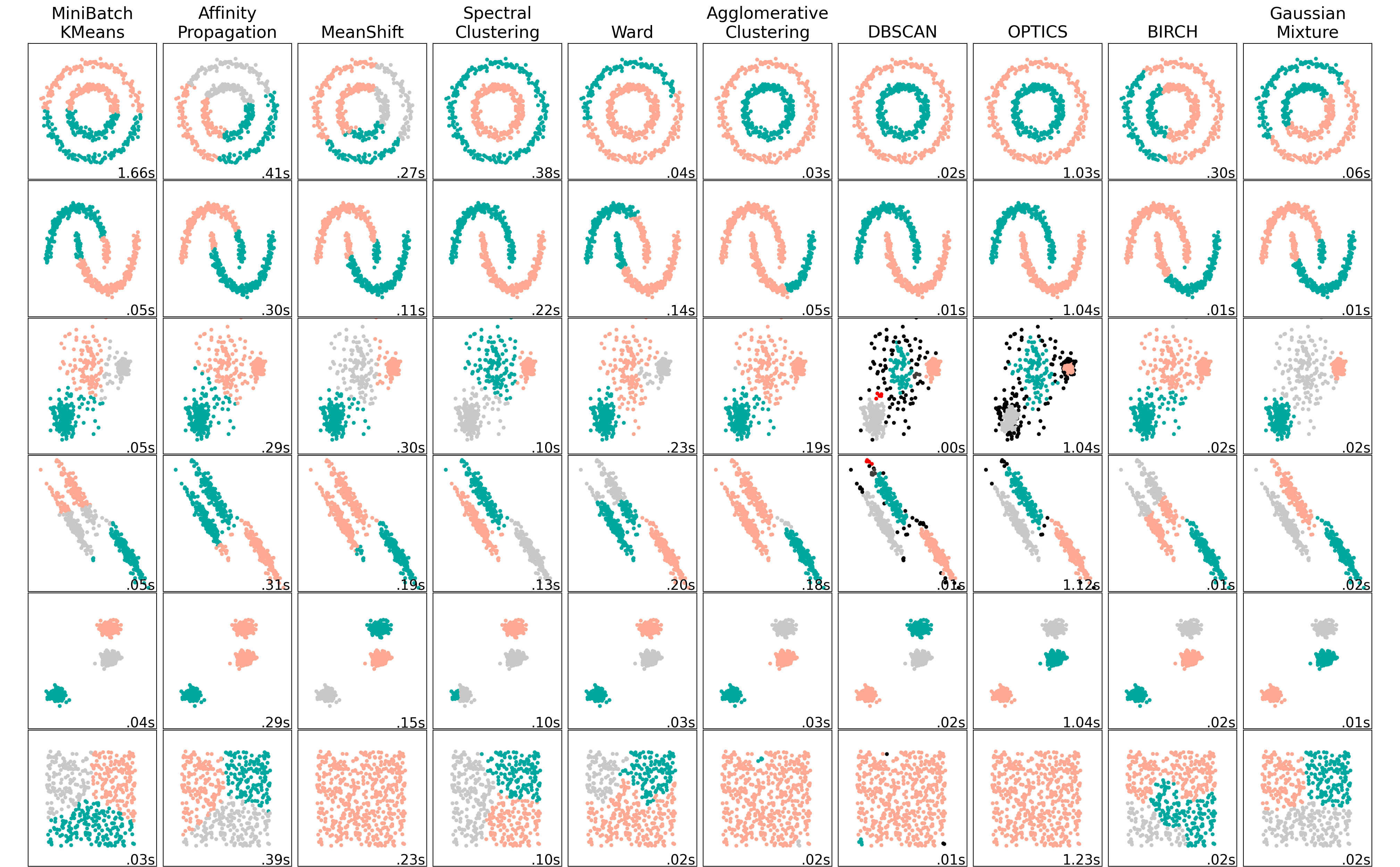
Figure 2.2: Comparing different clustering algorithms on toy datasets. Each color represents a different cluster.
In Urban Building Energy Modelling (UBEM), the algorithm that comes up most often and that has proven its effectiveness is Kmeans (Wang et al., 2022). However, on Figure 2.2, one can observe that the miniBatchKmeans do not always respond well in some situations. It is therefore helpful to investigate other clustering methods. This work proposes to use the GaussianMixture algorithm. GaussianMixture (sometimes called Expected Maximisation) is a robust clustering algorithm but has been very rarely used.
As the Figure illustrates, the two algorithms answer well to
most data distribution schemes, except for the one linked to data
density (schemes 1 and 2). This last type of pattern is not expected in
the district characteristics case, although it still should be verified that this assumption is relevant
in the result analysis. Additionally, they are algorithms that are well
optimised on the scikit-learn library (Pedregosa et al., 2011), allowing the
computational time to stay low.
2.2.1 Kmedoids
Kmedoids clustering is derived from the Kmeans, which groups the data based on how close they are, measured by the Euclidean distance. The mean value is taken to evaluate the similarity parameter to form clusters, hence the name. The algorithm is the following:
Input: Ky: the number of clusters Dy: a data set containing n object
Output: A set of Ky clusters
Algorithm:
1. Input the data set and value of Ky.
2. If Ky = 1 then Exit.
3. Else
4. Choose k objects from D randomly as the initial cluster centres.
5. For every data point in the cluster j reissue and define every object into the cluster where the object matches, based on the object’s mean value in the cluster.
6. Update cluster means; after that for each cluster calculate the object’s mean value.
7. Repeat from step 4 until no data point was assigned otherwise stop. The satisfying criteria can be either number of iteration or change of position of centroid in consecutive iterations
In Kmedoids, the mean is replaced by the “center” concept. Medoid is the most centrally located point of the cluster. So, there is a set of starting medoids at a random start that changes at each iteration. It is recommended to run the algorithm several times to avoid falling on a local optimum due to the starting point. Kmedoids leaves out the main drawback of Kmeans, which is the influence of the outliers, making it more robust.
Input: Ky: the number of clusters, Dy: a data set containing n objects.
Output: A set of ky clusters.
Algorithm:
1. Randomly select ky as the Medoids for n data points.
2. Find the closest Medoids by calculating the distance between data points n and Medoids k and map data objects to that.
3. For each Medoids m and each data point o associated to m do the following: Swap m and o to compute the total cost of the configuration, than Select the Medoids o with the lowest cost of the configuration.
4. If there is no change in the assignments repeat steps 2 and 3 alternatively.
It requires a number of clusters to run. If this parameter is unknown - no number of representatives categories of districts appears trivial at first glance - performance measures are used to determine which number of clusters gives the best result The validity index indicates the number of clusters that best suits a data set. Three of them are selected for this work:
- Elbow index: the elbow method consists in computing the sum of squared distances for each point to its assigned centroids (Syakur et al., 2018). The optimal number of clusters is the one where the drop in the distortion score is the most important (maximum curvature, illustrated by Figure 2.3). This method is commonly employed and easy to compute.
from sklearn.cluster import KMeans
from sklearn.datasets import make_blobs
from matplotlib.pyplot import *

from yellowbrick.cluster import KElbowVisualizer

EPFL_darkgrey = '#413D3A'
EPFL_light_grey = '#CAC7C7'
EPFL_red = '#FF0000'
EPFL_salmon = '#FEA993'
EPFL_leman = '#00A79F'
EPFL_canard = '#007480'
EPFL_colors = {0: 'black', 1: EPFL_darkgrey, 2: EPFL_light_grey, 3: EPFL_red, 4: EPFL_salmon, 5: EPFL_leman,
               6: EPFL_canard}
# Generate synthetic dataset with 8 random clusters
X, y = make_blobs(n_samples=1000, n_features=12, centers=8, random_state=42)

# Instantiate the clustering model and visualizer
model = KMeans(init='k-means++', max_iter=50)
visualizer = KElbowVisualizer(model, k=(4, 12), timings=False).fit(X)

y = visualizer.k_scores_
x = visualizer.k_values_

fig = figure()
plot(x, y, "-D", color=EPFL_colors[1], label='_nolegend_')
axvline(visualizer.elbow_value_, linestyle='--', linewidth=1, color=EPFL_colors[3], alpha=0.7,
        label="Elbow at k = %i, Score = %f" % (visualizer.elbow_value_, visualizer.elbow_score_))
title("Elbow score for KMeans clustering")
legend(frameon=True)
xlabel("Number of clusters [-]")
ylabel("Distorsion score [-]")
show()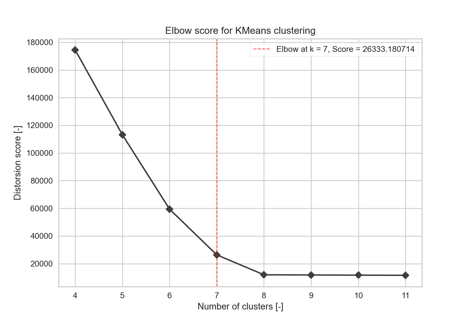
- Silhouette index: it is first defined on a point \(i\) that belongs to a cluster \(C_I\) as \(s(i)\). It is based on the point mean distance to all other data points in the same cluster \(a(i)\) (Equation (2.3)) and the point mean distance to the data points in the neighboring cluster \(b(i)\) - which is the cluster with the smallest mean dissimilarity (Equation (2.4)).
where \(N_{C_I}\) is the number of points belonging to cluster \(C_I\) and \(d(i,j)\) is the distance between points \(i\) and \(j\).
\[\begin{equation} b(i) = \min_{J\neq I} \frac{1}{N_{C_J}} \sum_{j\in C_J} d(i,j) \tag{2.4} \end{equation}\]where \(N_{C_J}\) is the number of points belonging to cluster \(C_J\) (and \(C_J \neq C_I\)).
The silhouette value of one data point \(i\) is defined with Equation (2.5)
\[\begin{equation} s(i) = \frac{b(i)-a(i)}{max(a(i),b(i))} \tag{2.5} \end{equation}\]From the last equation, \(-1 \leq s(i) \leq 1\). 1 means that the point \(i\) has a perfect match with its cluster, -1 with the neighboring cluster. Finally, the silhouette index is the mean of all coefficients \(s(i)\) (Equation (2.6)).
\[\begin{equation} Sil(C) = \frac{1}{N}\sum_{C_I \in C} \sum_{i \in C_I} s(i) \tag{2.6} \end{equation}\]with \(N\) the total number of data.
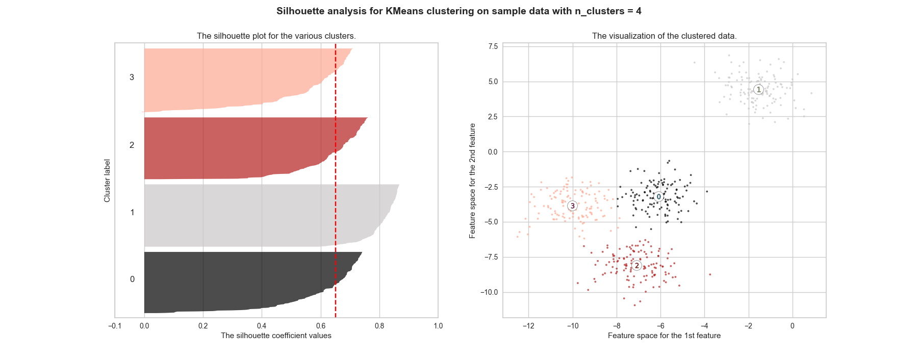
The final result should be as close as 1 as possible, meaning each point is assigned to the cluster with the best correspondence. If it is around 0, the clustering is as good as if it was randomly done. Moreover, when a poor choice of \(k\) is picked, it is likely to have very different widths when plotting the silhouette of each cluster. Figure 2.4 shows that \(k=2\) has the highest score, but \(k=4\) is close enough. Figure ?? further highlights that the repartition is better for the \(k=4\) cluster, making it the number that should be picked.
from sklearn.cluster import KMeans
from sklearn.datasets import make_blobs
from matplotlib.pyplot import *

from yellowbrick.cluster import KElbowVisualizer

EPFL_darkgrey = '#413D3A'
EPFL_light_grey = '#CAC7C7'
EPFL_red = '#FF0000'
EPFL_salmon = '#FEA993'
EPFL_leman = '#00A79F'
EPFL_canard = '#007480'
EPFL_blueadd  = '#1246B5'
EPFL_yellow = '#FFB100'
EPFL_darkyellow = '#A57300'
EPFL_green = '#69B58A'
EPFL_lightyellow = '#FECC93'
EPFL_colors = {0: 'black', 1: EPFL_darkgrey, 2: EPFL_light_grey, 3: EPFL_red,
               4: EPFL_salmon,5: EPFL_leman,
               6: EPFL_canard, 7:EPFL_blueadd, 8:EPFL_green, 9: EPFL_lightyellow,
               10:EPFL_yellow, 11:EPFL_darkyellow}
# Generate synthetic dataset with 8 random clusters
X, y = make_blobs(
    n_samples=500,
    n_features=2,
    centers=4,
    cluster_std=1,
    center_box=(-10.0, 10.0),
    shuffle=True,
    random_state=1,
)
# Instantiate the clustering model and visualizer
model = KMeans(init='k-means++', max_iter=50)
visualizer = KElbowVisualizer(model, k=(2, 8), timings=False, metric='silhouette').fit(X)

y = visualizer.k_scores_
x = visualizer.k_values_
opt_score = max(visualizer.k_scores_)
opt_k = 2

fig = figure()
plot(x, y, "-D", color=EPFL_colors[1], label='_nolegend_')
axvline(opt_k, linestyle='--', linewidth=1, color=EPFL_colors[3], alpha=0.7,
        label="K_{opt} at k = %i, Score = %f" % (opt_k, opt_score))
title("Silhouette score for KMeans clustering")
legend(frameon=True)
xlabel("Number of clusters [-]")
ylabel("Silhouette score [-]")
show()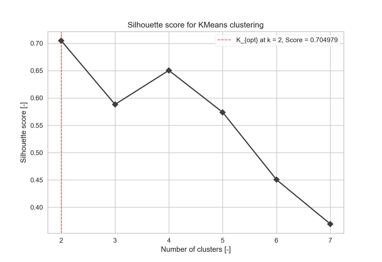
from sklearn.datasets import make_blobs
from sklearn.cluster import KMeans
from sklearn.metrics import silhouette_samples, silhouette_score

import matplotlib.cm as cm

EPFL_darkgrey = '#413D3A'
EPFL_light_grey = '#CAC7C7'
EPFL_red = '#FF0000'
EPFL_salmon = '#FEA993'
EPFL_groseille = '#B51F1F'
EPFL_leman = '#00A79F'
EPFL_canard = '#007480'
EPFL_blueadd = '#1246B5'
EPFL_yellow = '#FFB100'
EPFL_darkyellow = '#A57300'
EPFL_green = '#69B58A'
EPFL_lightyellow = '#FECC93'
EPFL_colors = {0: 'black', 1: EPFL_light_grey, 2: EPFL_groseille,
               3: EPFL_salmon, 4: EPFL_leman,
               5: EPFL_canard, 6: EPFL_blueadd, 7: EPFL_red, 8: EPFL_green, 9: EPFL_lightyellow,
               10: EPFL_yellow, 11: EPFL_darkyellow, 12: EPFL_darkgrey}
# Generating the sample data from make_blobs
# This particular setting has one distinct cluster and 3 clusters placed close
# together.
X, y = make_blobs(
    n_samples=500,
    n_features=2,
    centers=4,
    cluster_std=1,
    center_box=(-10.0, 10.0),
    shuffle=True,
    random_state=1,
)  # For reproducibility

range_n_clusters = [2, 4]

for n_clusters in range_n_clusters:
    # Create a subplot with 1 row and 2 columns
    fig, (ax1, ax2) = plt.subplots(1, 2)
    fig.set_size_inches(18, 7)

    # The 1st subplot is the silhouette plot
    # The silhouette coefficient can range from -1, 1 but in this example all
    # lie within [-0.1, 1]
    ax1.set_xlim([-0.1, 1])
    # The (n_clusters+1)*10 is for inserting blank space between silhouette
    # plots of individual clusters, to demarcate them clearly.
    ax1.set_ylim([0, len(X) + (n_clusters + 1) * 10])

    # Initialize the clusterer with n_clusters value and a random generator
    # seed of 10 for reproducibility.
    clusterer = KMeans(n_clusters=n_clusters, random_state=10)
    cluster_labels = clusterer.fit_predict(X)

    # The silhouette_score gives the average value for all the samples.
    # This gives a perspective into the density and separation of the formed
    # clusters
    silhouette_avg = silhouette_score(X, cluster_labels)
    print(
        "For n_clusters =",
        n_clusters,
        "The average silhouette_score is :",
        silhouette_avg,
    )

    # Compute the silhouette scores for each sample
    sample_silhouette_values = silhouette_samples(X, cluster_labels)

    y_lower = 10
    for i in range(n_clusters):
        # Aggregate the silhouette scores for samples belonging to
        # cluster i, and sort them
        ith_cluster_silhouette_values = sample_silhouette_values[cluster_labels == i]

        ith_cluster_silhouette_values.sort()

        size_cluster_i = ith_cluster_silhouette_values.shape[0]
        y_upper = y_lower + size_cluster_i

        color = EPFL_colors[i]
        ax1.fill_betweenx(
            np.arange(y_lower, y_upper),
            0,
            ith_cluster_silhouette_values,
            facecolor=color,
            edgecolor=color,
            alpha=0.7,
        )

        # Label the silhouette plots with their cluster numbers at the middle
        ax1.text(-0.05, y_lower + 0.5 * size_cluster_i, str(i))

        # Compute the new y_lower for next plot
        y_lower = y_upper + 10  # 10 for the 0 samples

    ax1.set_title("The silhouette plot for the various clusters.")
    ax1.set_xlabel("The silhouette coefficient values")
    ax1.set_ylabel("Cluster label")

    # The vertical line for average silhouette score of all the values
    ax1.axvline(x=silhouette_avg, color="red", linestyle="--")

    ax1.set_yticks([])  # Clear the yaxis labels / ticks
    ax1.set_xticks([-0.1, 0, 0.2, 0.4, 0.6, 0.8, 1])

    # 2nd Plot showing the actual clusters formed
    colors = []
    for col in range(X.shape[0]):
        colors.append(EPFL_colors[cluster_labels[col]])
    ax2.scatter(
        X[:, 0], X[:, 1], marker=".", s=30, lw=0, alpha=0.7, c=colors, edgecolor="k"
    )

    # Labeling the clusters
    centers = clusterer.cluster_centers_
    # Draw white circles at cluster centers
    ax2.scatter(
        centers[:, 0],
        centers[:, 1],
        marker="o",
        c="white",
        alpha=1,
        s=200,
        edgecolor="k",
    )

    for i, c in enumerate(centers):
        ax2.scatter(c[0], c[1], marker="$%d$" % i, alpha=1, s=50, edgecolor="k")

    ax2.set_title("The visualization of the clustered data.")
    ax2.set_xlabel("Feature space for the 1st feature")
    ax2.set_ylabel("Feature space for the 2nd feature")

    plt.suptitle(
        "Silhouette analysis for KMeans clustering on sample data with n_clusters = %d"
        % n_clusters,
        fontsize=14,
        fontweight="bold",
    )

    plt.savefig("figures/silhouette_%d.png" % n_clusters)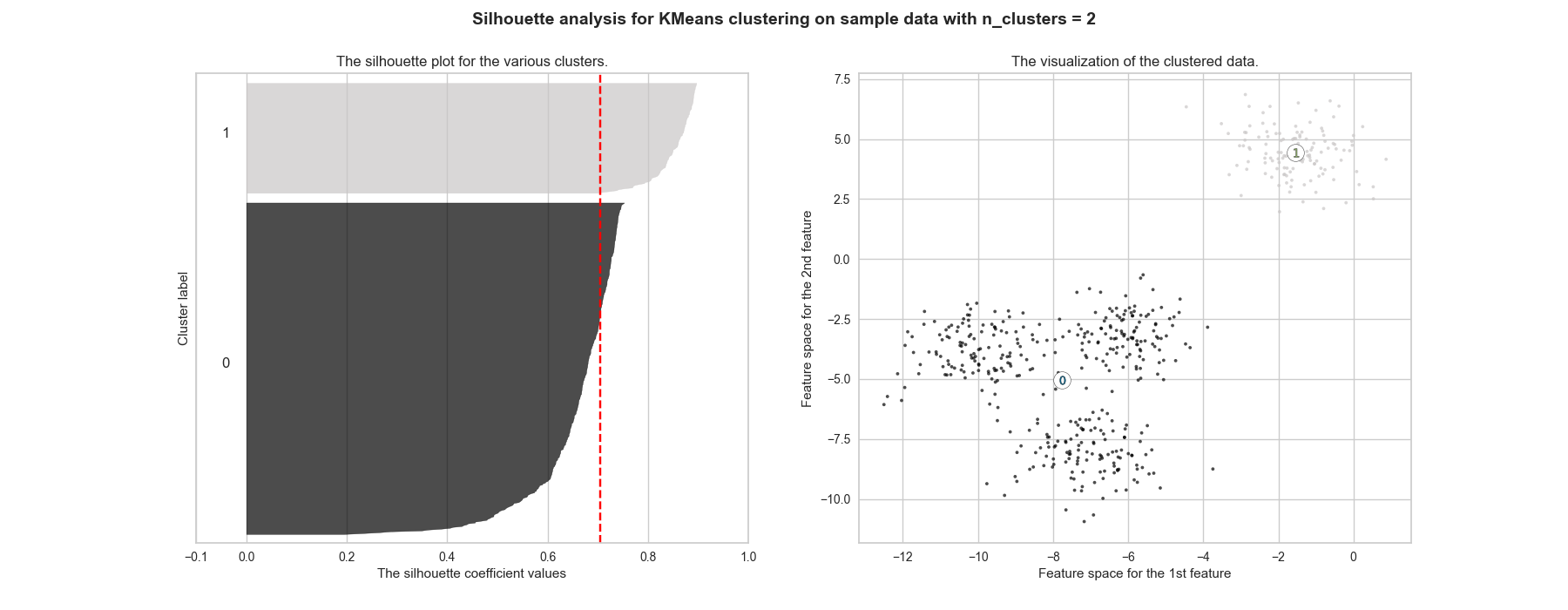
Arbelaitz et al. (2013) states the silhouette coefficient is the index that performs the best in most clustering applications, whether there is a high point density, noise or cluster overlap. To evaluate a Kmeans clustering, it is ranked the 2\(^{nd}\) best index after the Calinski-Harabasz, which is the one detailed hereafter.
- Calinski-Harabasz index: it estimates the cohesion of clusters. It evaluates the distance from points in a cluster to the centroids and the distance from the centroids to a global centroid. Equation (2.7) provides the formula.
where:
- \(K\) is the total number of clusters,
- \(C_k \in C\) is a cluster that belongs to the set of clusters,
- \(N_{C_k}\) the number of points in cluster \(k\),
- \(\bar{c_k}\) is the centroid of the cluster defined as: \[ \bar{C_k} = \frac{1}{N_{C_k}}\sum_{i \in C_k}i \]
- and \(\bar{X}\) is the centroid of the dataset defined as: \[ \bar{X} = \frac{1}{N}\sum_{i \in X}i \]
X, y = make_blobs(
    n_samples=500,
    n_features=2,
    centers=4,
    cluster_std=1,
    center_box=(-10.0, 10.0),
    shuffle=True,
    random_state=1,
)
visualizer = KElbowVisualizer(model, k=(4, 12), timings=False, metric='calinski_harabasz').fit(X)

y = visualizer.k_scores_
x = visualizer.k_values_
opt_score = max(visualizer.k_scores_)
opt_k = 8

fig = figure()
plot(x, y, "-D", color=EPFL_colors[12], label='_nolegend_')
axvline(visualizer.elbow_value_, linestyle='--', linewidth=1, color=EPFL_colors[2], alpha=0.7,
        label="K_{opt} at k = %i, Score = %f" % (visualizer.elbow_value_, visualizer.elbow_score_))
title("Calinski-Harabasz score for KMeans clustering")
legend(frameon=True)
xlabel("Number of clusters [-]")
ylabel("Calinski-Harabasz score [-]")
show()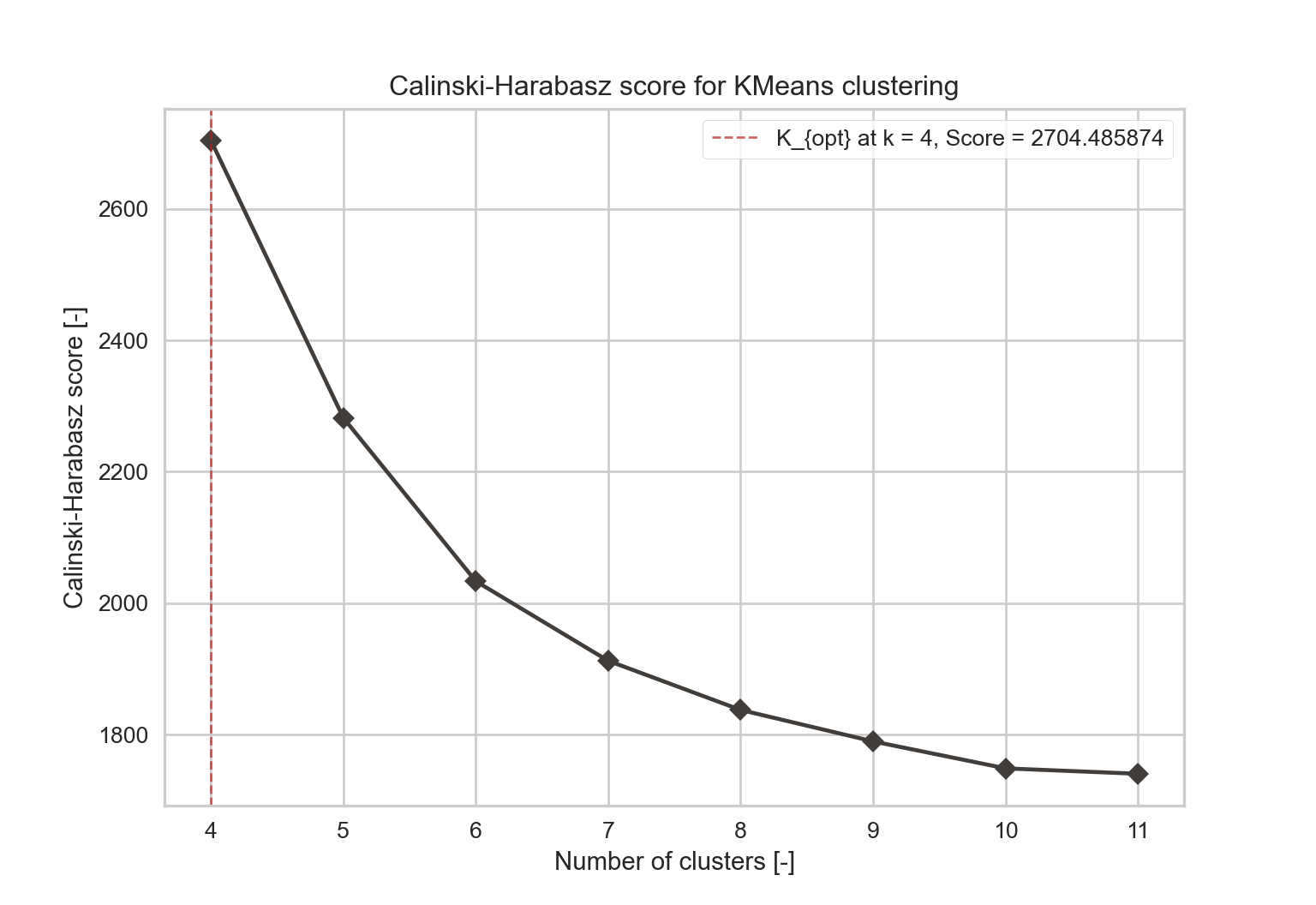
2.2.2 Gaussian Mixture
As its name suggests, a Gaussian mixture model summarises a multivariate probability density
function with a mixture of Gaussian probability distributions. It is particularly resilient to a noisy dataset.
The probability densities are given in Equation (2.8).
where:
- \(x\) is a D-dimensional continuous-valued data vector,
- \(w_i, \; i=1,...,M\) are the mixture weights, satisfying \(\sum_{i=1}^{M}w_i = 1\)
- \(g\left(x \mid \mu_i, \sum\nolimits _i\right)\) are the component Gaussian densities. Each density is a Gaussian function of the form:
\[
g\left(x \mid \mu_i, \sum\nolimits _i\right) = \frac{1}{(2\pi)^{D/2}\lvert\sum\nolimits _i \rvert^{1/2}}exp\left(-\frac{1}{2}(x-\mu_i)' \sum\nolimits _i^{-1} (x-\mu_i) \right)
\]
with \(\mu_i\) the mean vector and \(\sum\nolimits _i\) the covariance
matrix. Those are the parameters of the Gaussian mixture Model (GMM),
resumed into \(\lambda=(w_i,\mu_i,\sum\nolimits _i)\). The covariance
matrix can vary to have more model options: it can be full rank or
diagonal and can be common to all the components or not. The covariance
matrix type and the number of components are thus the parameters that
define the GMM.
The algorithm to define the clusters is the following:
Algorithm: Mixture-of-Gaussian Clustering Input: Data set \(D = (\boldsymbol{x}_1, \boldsymbol{x}_2,...,\boldsymbol{x}_m)\);
Number of Gaussian mixture components k.
Process:
1: Initialize the parameters \({(\alpha_i,\mu_i, \sum_i)\ |\ 1 \leq i \leq k}\) of the Mixture-of-Gaussian distribution;
2: repeat
3: for j = 1,2,…, m do
4: Compute the posterior probabilities that \(\boldsymbol{x}_j\) is generated by each Gaussian mixture component, i.e., \(\gamma_{ji} = g(z_j = i\ |\ \boldsymbol{x}_j)(1 \leq i \leq k)\);
5: end for
6: for i = 1, 2,…, k do
7: Compute the updated mean vector: \(\mu_i' = \frac{\sum\gamma_{ji}\boldsymbol{x}_j}{\sum \gamma_{ji}}\);
8: Compute the updated covariance matrix: \(\boldsymbol{\sum}'_i = \frac{\sum \gamma_{ji}(\boldsymbol{x}_j-\mu_i')(\boldsymbol{x}_j-\mu_i')^T}{\sum \gamma_{ji}}\);
9: Compute the updated mixture coefficients: \(\alpha_i'= \frac{1}{m}\sum\gamma_{ji}\);
10: end for
11: Update the model parameters \(((\alpha_i,\mu_i, \sum_i)\ |\ 1 \leq i \leq k)\) to \(((\alpha_i',\mu_i', \sum_i')\ |\ 1 \leq i \leq k)\)
12: until The termination condition is met;
13: \(C_i = \emptyset (1 \leq i \leq k)\);
14: for j = 1, 2,…, m do
15: Determine the cluster label \(\lambda_j\) of \(\boldsymbol{x}_j\);
16: Move \(\boldsymbol{x}_j\) to the corresponding cluster: \(C_{\lambda_j} = C_{\lambda_j} \cup (\boldsymbol{x}_j)\).
17: end for
Output: Clusters \(C = {C_1, C_2,..., C_k}\). >
If not available, similarly to the method in 2.2.1, selection
criterion calculations are used to determine a posteriori which
configuration is the best.
The criteria use the likelihood function as a basis. The likelihood function evaluates the joint probability of observed data as a function
of the chosen statistical model. Given a set of T training vectors
\(X=(x_1,...,x_T)\), the GMM likelihood function can be written as in
Equation (2.9).
This function has to be maximised to obtain the best result, which means the model would have predicted data accurately. However, adding components helps increase the likelihood while it may lead to overfitting the data. Criterions introduce penalty terms on the number of parameters to solve the issue
- Akaike Information Criterion (AIC): defined by Equation (2.10), it should be as small as possible. It is an efficient criterion when the model is very complex and is chosen in this context. However, the BIC would be preferred when there exists “a fixed, finite-dimensional true model” as it has a higher probability of finding it.
where \(\hat L\) is the maximised value of the likelihood function of the GMM defined in Equation (2.9), \(k_\lambda\), the numbers of estimated parameters of the model.
- Bayesian Information Criterion (BIC): defined by Equation (2.11), the BIC should also be as small as possible. It has consistency (meaning it would asymptotically select the candidate model having the correct structure), as its penalty term contains \(n\). It tends to “choose models that are more parsimonious than AIC.” (Neath and Cavanaugh, 2012)
\[\begin{equation} BIC = k\cdot ln(n) - 2\cdot ln(\hat L) \tag{2.11} \end{equation}\] with \(n\), the sample size.
References
© EPFL-IPESE 2022
Master thesis, Spring 2022
Joseph Loustau